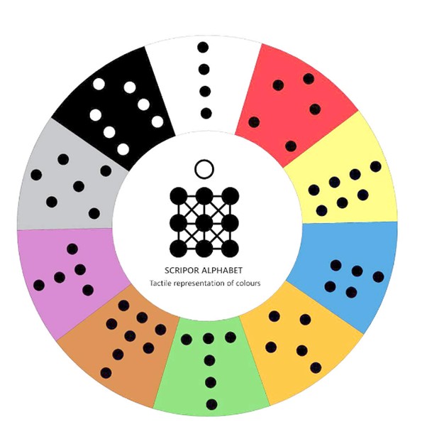
Scripor Alphabet - a tactile presentation of colours
Experience from the "Reha for the blind" conference in Poland
Rolf Lund, Researcher at Eikholt, recently attended The Chance Foundation's international conference, Reha for the blind, in Poland. One of the most important topics he will take home from this conference is the Scripor alphabet, a tactile colour alphabet. Rolf Lund believes this could revolutionise how visually impaired people relate to colours.
What is the Scripor alphabet
The Scripor alphabet, named after the creator Tudor Paul Scripor, is a unique, universal system that enables visually impaired people to read, write, identify, recognise and distinguish between colours using tactile symbols. Each colour is represented by a combination of dots in a cell similar to the Braille alphabet, but with more dots to cover the entire colour spectrum.
Why are colours so important?
Colour is one of the first ways children learn to understand and structure their world. Colours are universally used as an easy way to transmit information - from traffic signs to marking dangerous situations. Unfortunately, visually impaired people haven't had access to this important source of information, which creates barriers in everyday life.
The Scripor alphabet breaks down these barriers by giving visually impaired people access to the same information that sighted people get through colour. This contributes to increased independence, safety and participation in society.
How does the Scripor alphabet work?
The alphabet is based on a system of 10 dots: three columns and three rows, as well as an orientation dot to avoid confusion with Braille. Each colour is represented by a specific combination of dots, while adjacent cells are used to show shades, saturation and intensity.
By following the principles of universal design, the system represents:
- Primary colours red, yellow and blue
- Secondary colours orange, green, purple
- The tertiary colour brown
- The achromatic colours grey, white and black
The b of the Scripor alphabethe significance for people with impaired vision
The Scripor alphabet can be used in a variety of contexts - from food and clothing to sports equipment and toys. This makes it easier for visually impaired people to choose products, navigate everyday life and participate in activities with greater independence and confidence.
The alphabet has a short learning time and can be introduced early. In fact, blind children can learn the colour alphabet before they learn Braille, opening up a whole new learning perspective.
The Scripor alphabet gives visually impaired people greater opportunities to participate on equal terms in a world where colour plays an important role. The system is tactile, making it suitable for people with combined visual and hearing impairments.
Through this simple yet effective solution, products, services and everyday life can be made more accessible to millions of people around the world. This is a huge step towards a more inclusive future.
Want to read about Eikholt?
Read more about our services
Read about our group course
If you want to read more about us, you can find it here: About us
Do you have any questions? You can find contact information here: Contact us